Plot geoms
Adding smoothers
## `geom_smooth()` using method = 'loess' and formula = 'y ~ x'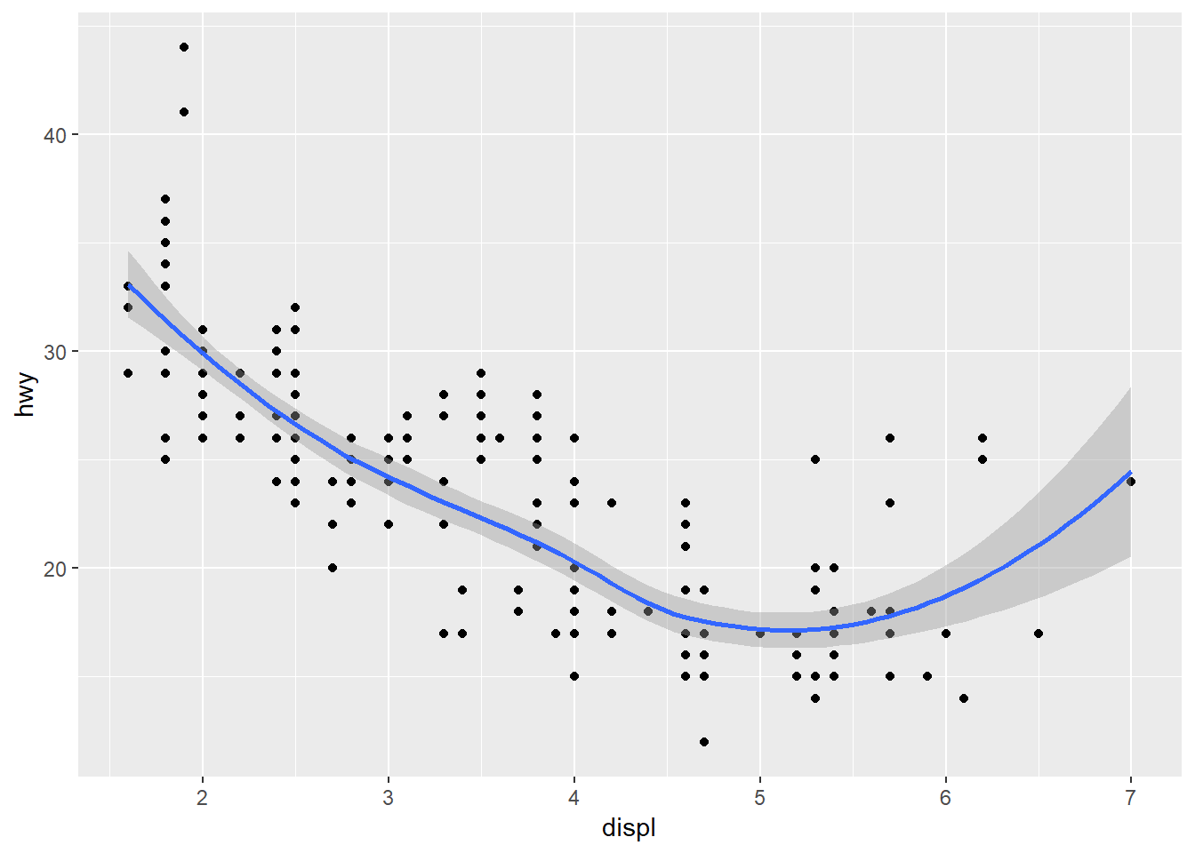
Turn off confidence interval
## `geom_smooth()` using method = 'loess' and formula = 'y ~ x'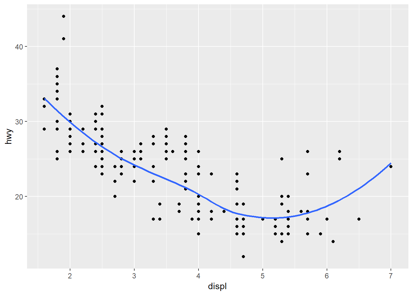
Wiggly
## `geom_smooth()` using method = 'loess' and formula = 'y ~ x'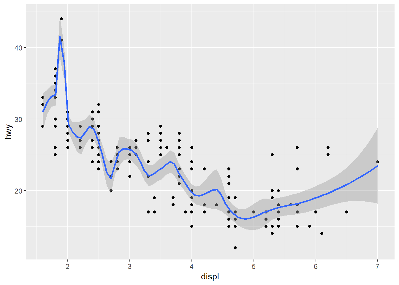
Smooth
## `geom_smooth()` using method = 'loess' and formula = 'y ~ x'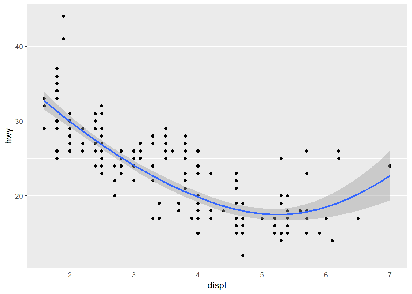
Animate through span values
library(ggplot2)
library(gganimate)
library(dplyr)

span_values <- seq(0.1, 1, by = 0.1)

create_loess_data <- function(span) {
  # apply loess smoothing with the current span value
  loess_model <- loess(hwy ~ displ, data = mpg, span = span)

  # Create a data frame with the fitted values from the loess model
  smoothed <- data.frame(
    displ = mpg$displ,
    hwy = mpg$hwy,
    fitted = predict(loess_model),
    span = span
  )

  return(smoothed)
}

# calculate smoothed data for each span value using loess
smoothed_data <- bind_rows(
  lapply(span_values, FUN = create_loess_data)
)

# use precomputed data
p <- ggplot(smoothed_data, aes(displ, hwy)) +
  geom_point() +
  geom_line(aes(y = fitted, group = span, color = factor(span)), linewidth = 2) +
  transition_manual(span) +  # animate over the span values
  labs(title = "Loess Smoothing with span = {current_frame}",
       x = "Displacement",
       y = "Highway MPG")

# render animation
animate(p, nframes = length(span_values), duration = 5, width = 600, height = 400)
?loess
library(mgcv)
library(MASS)

ggplot(mpg, aes(displ, hwy)) +
  geom_point() +
  geom_smooth(se = FALSE, color = "black") +
  geom_smooth(method = "gam", formula = y ~ s(x), color = "blue", se = FALSE) +  # GAM smoothing
  geom_smooth(method = "lm", color = "red", se = FALSE) + # Linear regression
  geom_smooth(method = "rlm", color = "darkgreen", se = FALSE)
## `geom_smooth()` using method = 'loess' and formula = 'y ~ x'
## `geom_smooth()` using formula = 'y ~ x'
## `geom_smooth()` using formula = 'y ~ x'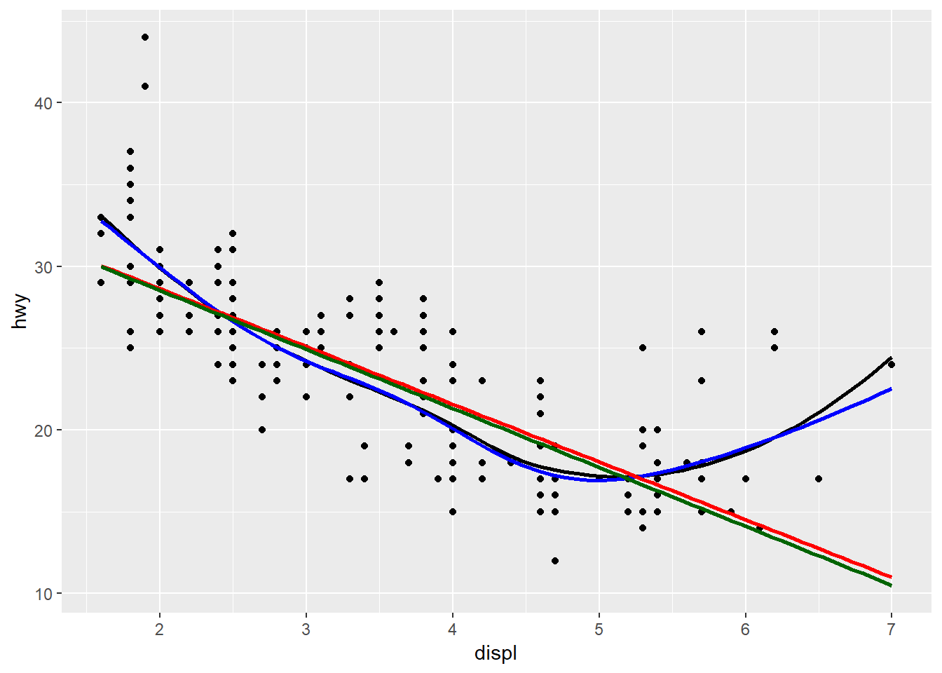
Box plots
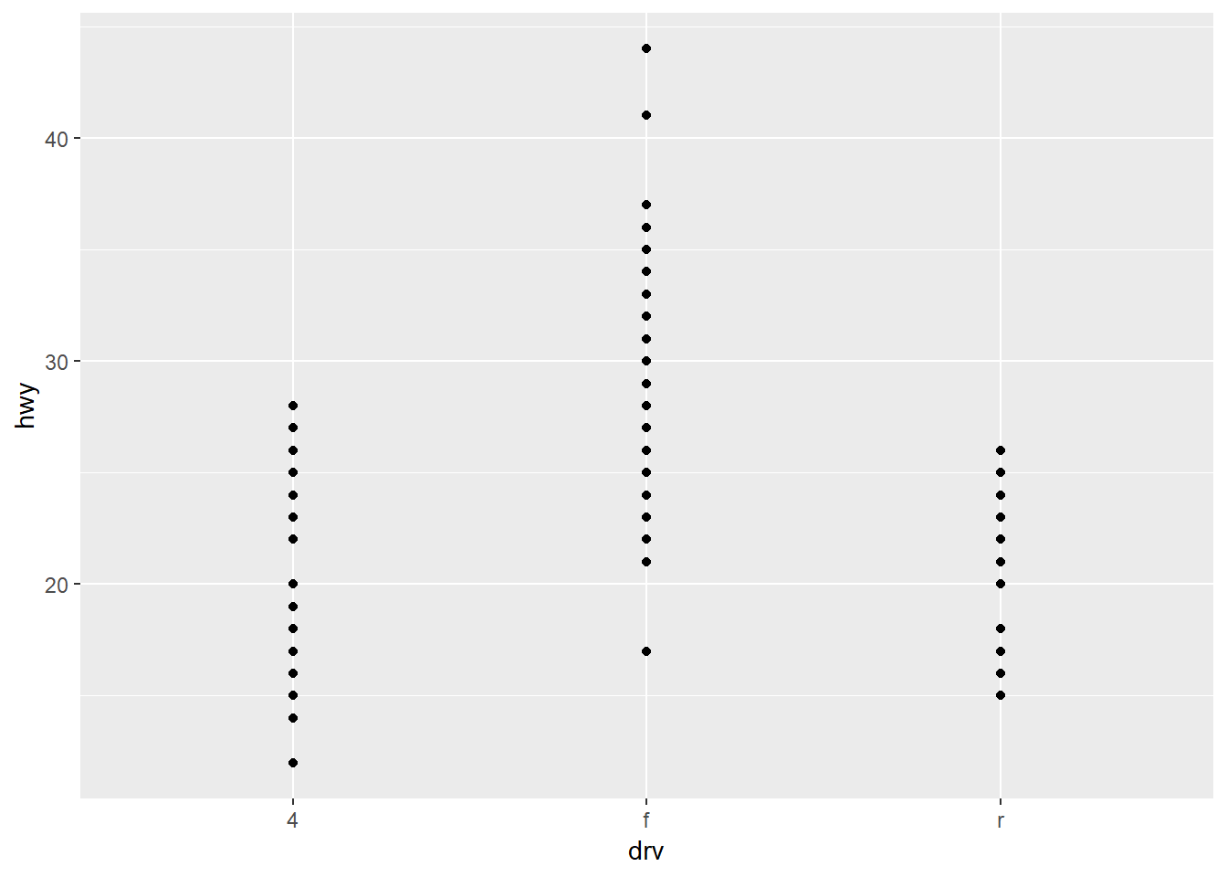
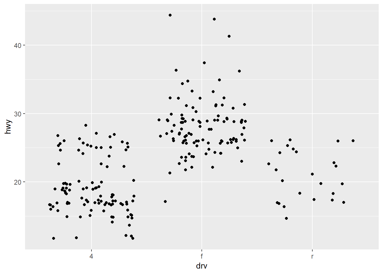
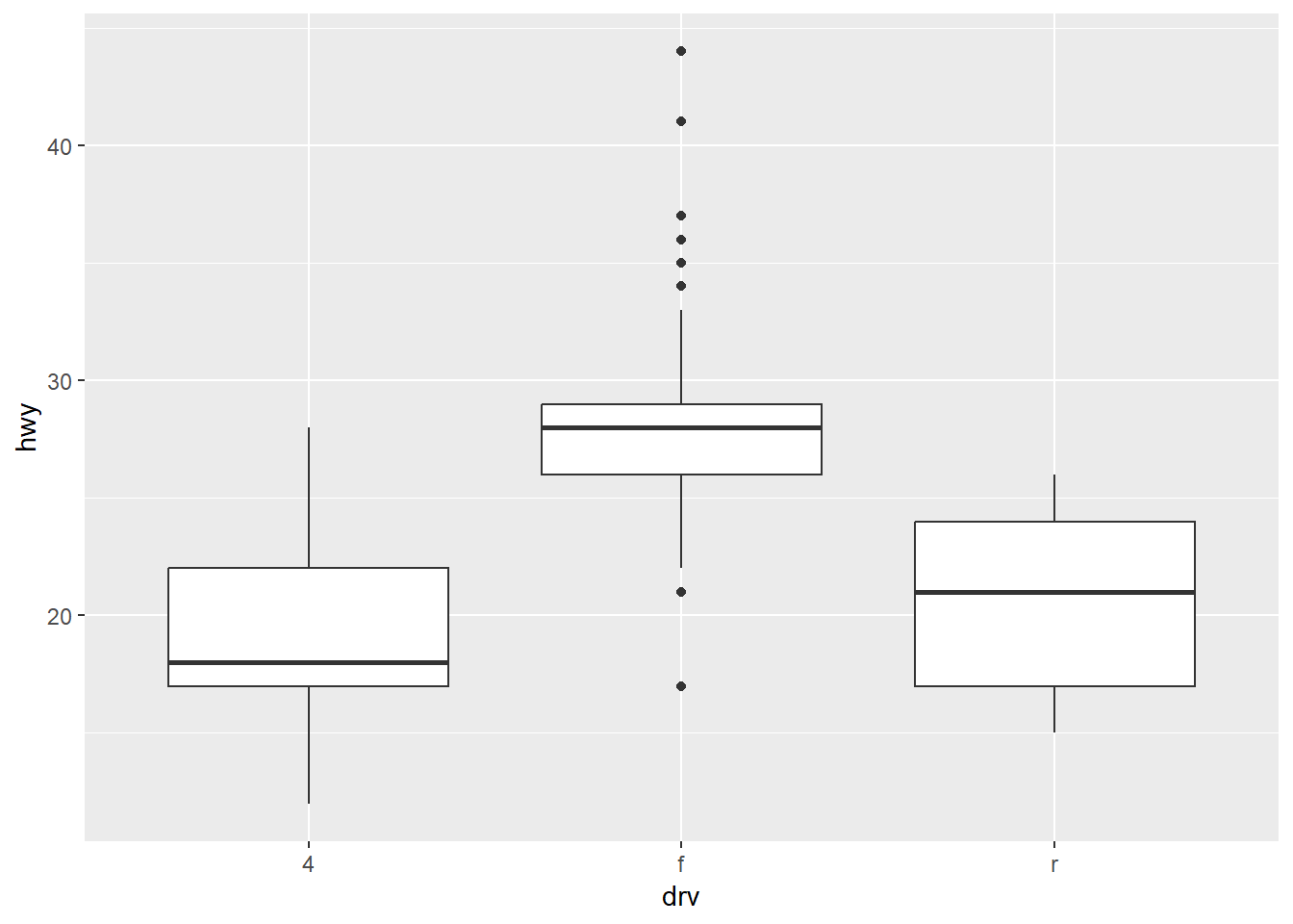
ggplot(mpg, aes(drv, hwy, col = drv)) +
  geom_boxplot() +
  geom_jitter() +
  theme(legend.position = "none")  # remove legend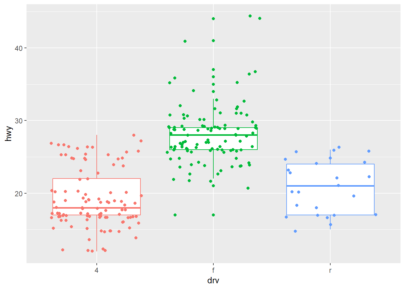
1.0.2 Histograms and frequency polygons
## `stat_bin()` using `bins = 30`. Pick better value with `binwidth`.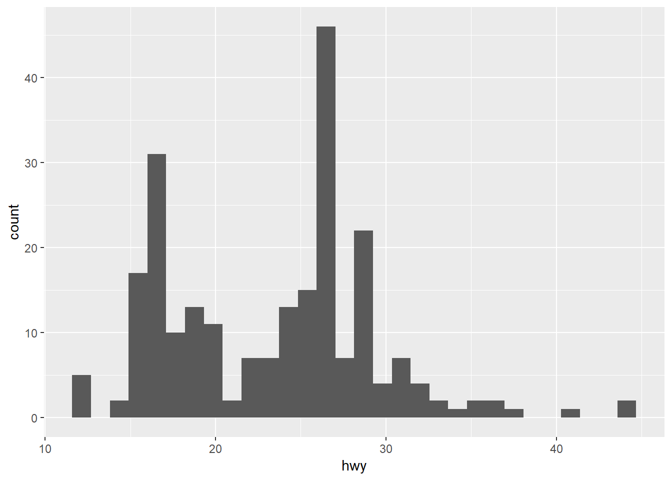
#> `stat_bin()` using `bins = 30`. Pick better value with `binwidth`.

ggplot(mpg, aes(hwy)) + geom_freqpoly()
## `stat_bin()` using `bins = 30`. Pick better value with `binwidth`.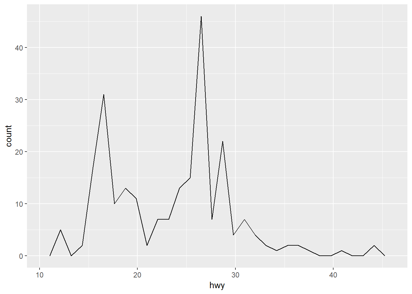
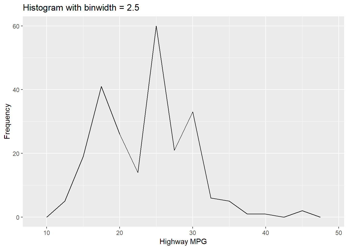
Interactively change binwidth
library(manipulate)

manipulate(
  ggplot(mpg, aes(hwy)) +
    geom_freqpoly(binwidth = binwidth) +
    labs(title = paste("Histogram with binwidth =", binwidth),
         x = "Highway MPG", y = "Frequency"),
  binwidth = slider(0.5, 7, step = 0.1, initial = 2.5)
)
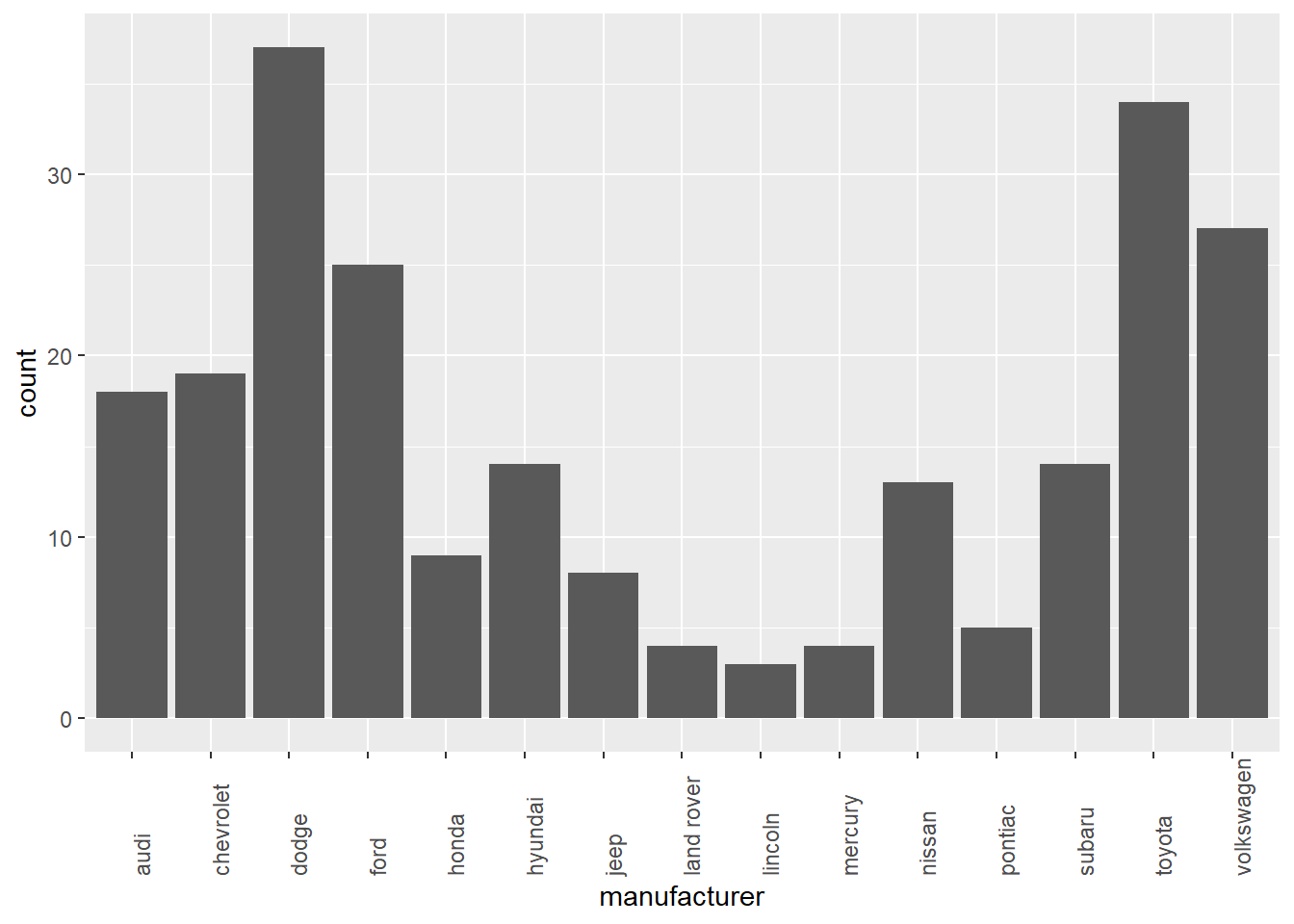
1.0.3 Bar charts
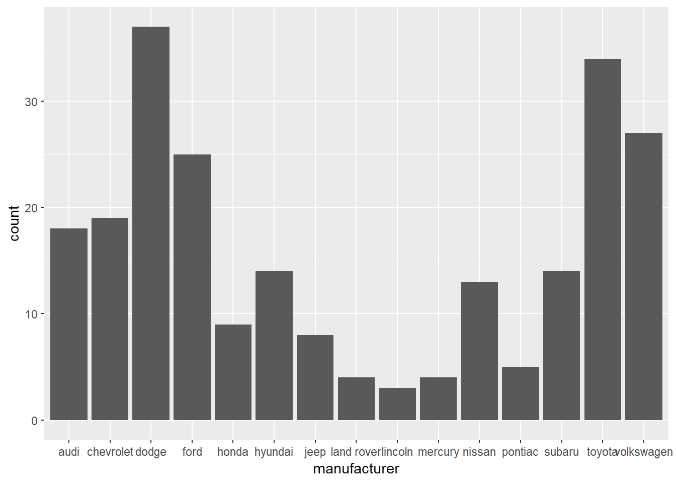
Rotate x-axis labels
ggplot(mpg, aes(manufacturer)) +
geom_bar() +
theme(axis.text.x = element_text(angle = 45, hjust = 1)) # rotate x-axis labels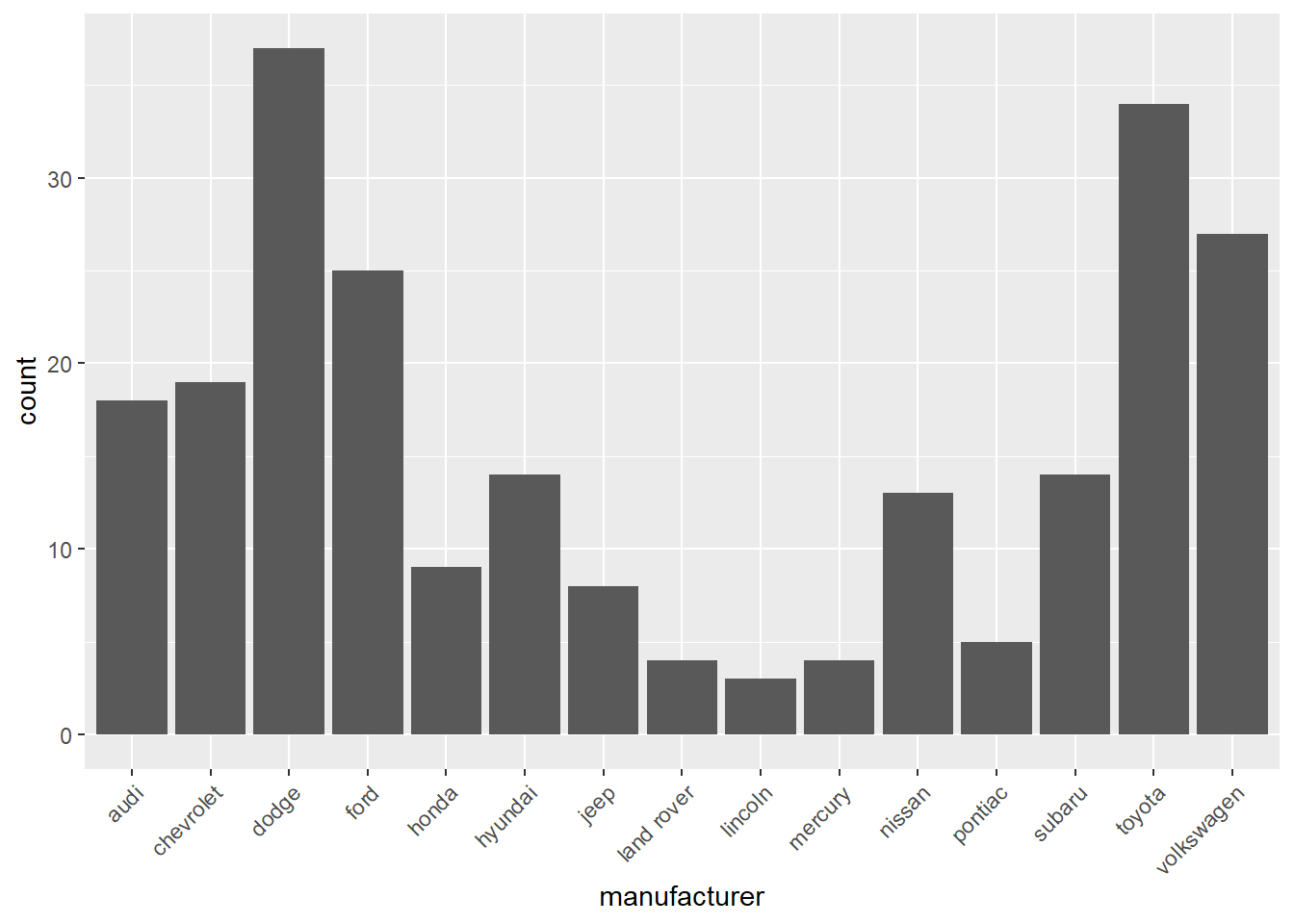
Vary placement of x-axis labels
ggplot(mpg, aes(manufacturer)) +
  geom_bar() +
  theme(axis.text.x = element_text(angle = 90, hjust = 0))  # rotate x-axis labels