Exercises

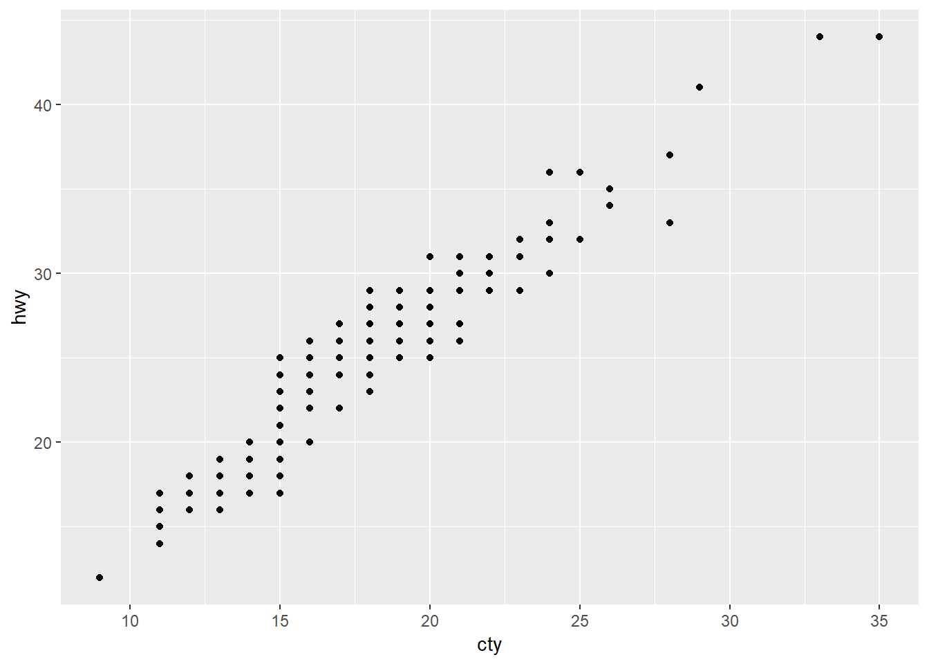
- directly correlated
- issues
- discrete measurements
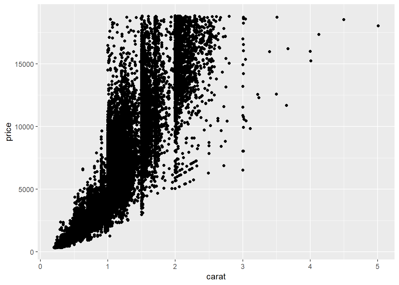
- overplotting
- scale
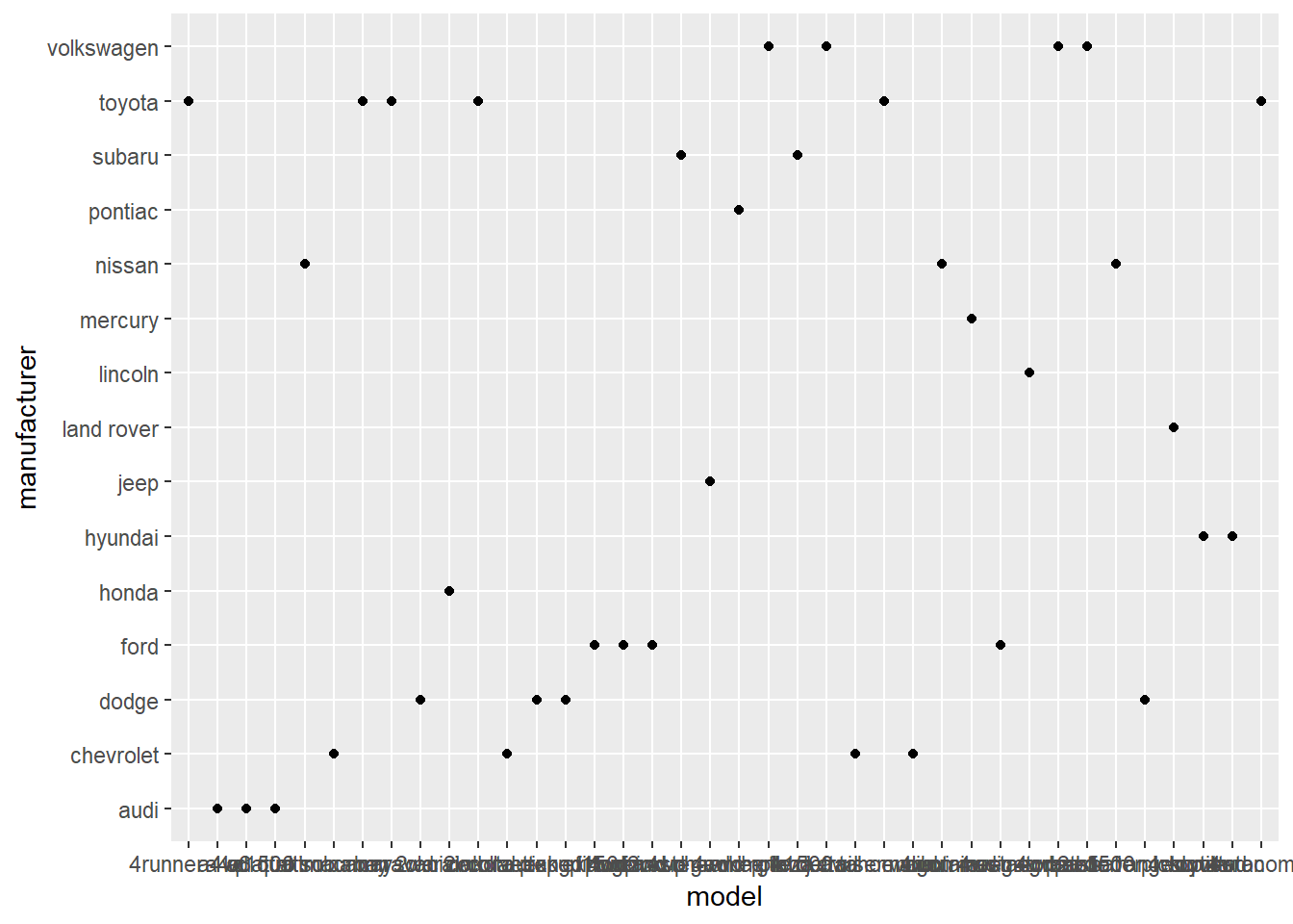
This plot maps model (specific car models) to the x-axis and manufacturer to the y-axis. Each point represents one observation in the dataset.
usefulness
both variables are categorical
no natural order
cluttered
informative
aggregate
reorder
facet
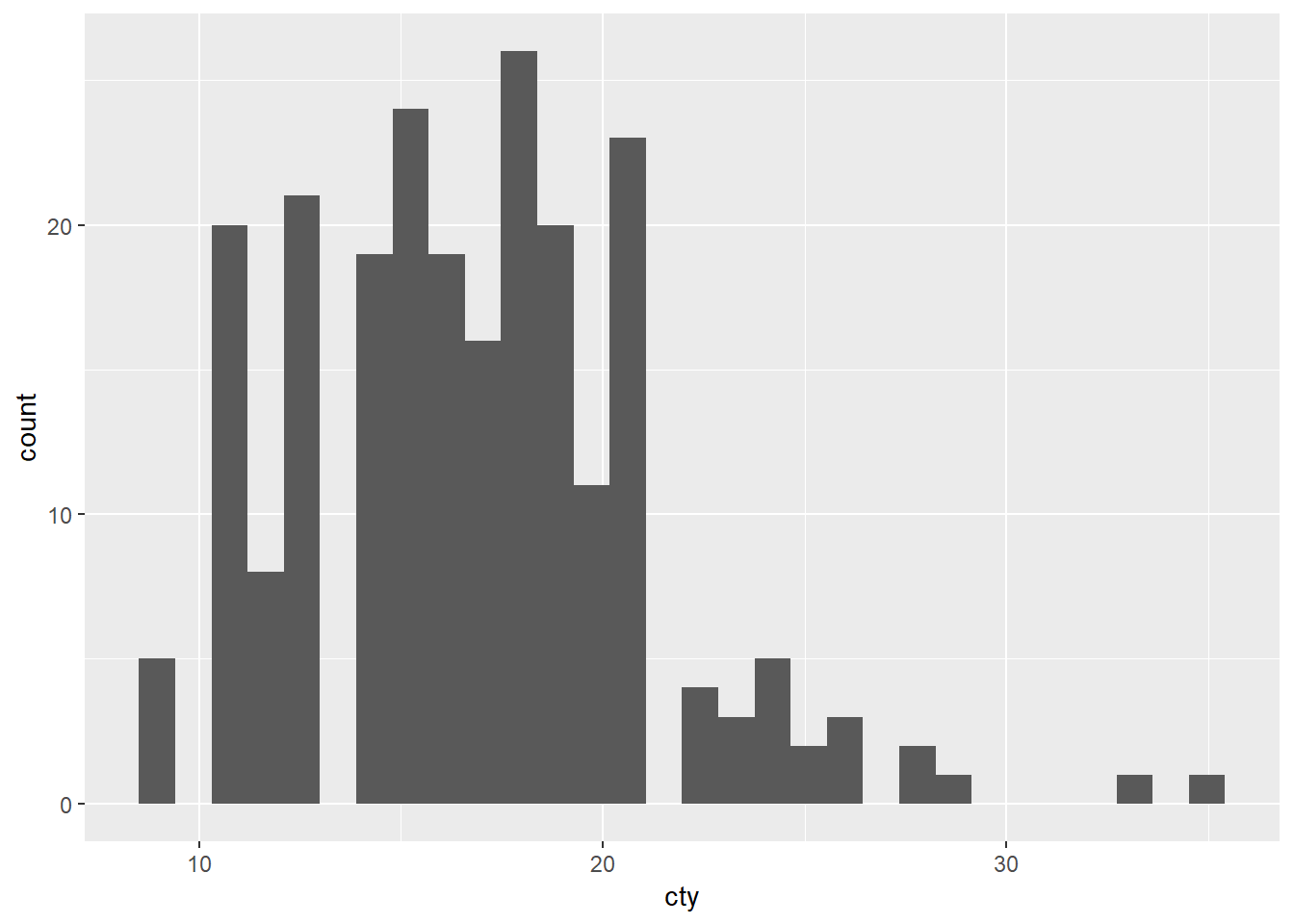
## `stat_bin()` using `bins = 30`. Pick better value with `binwidth`.