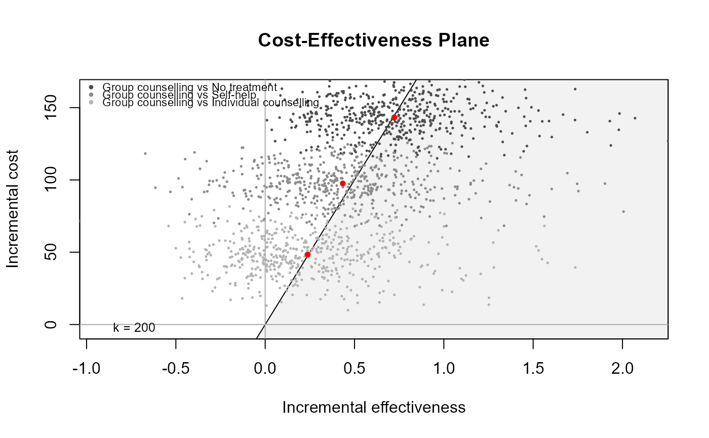
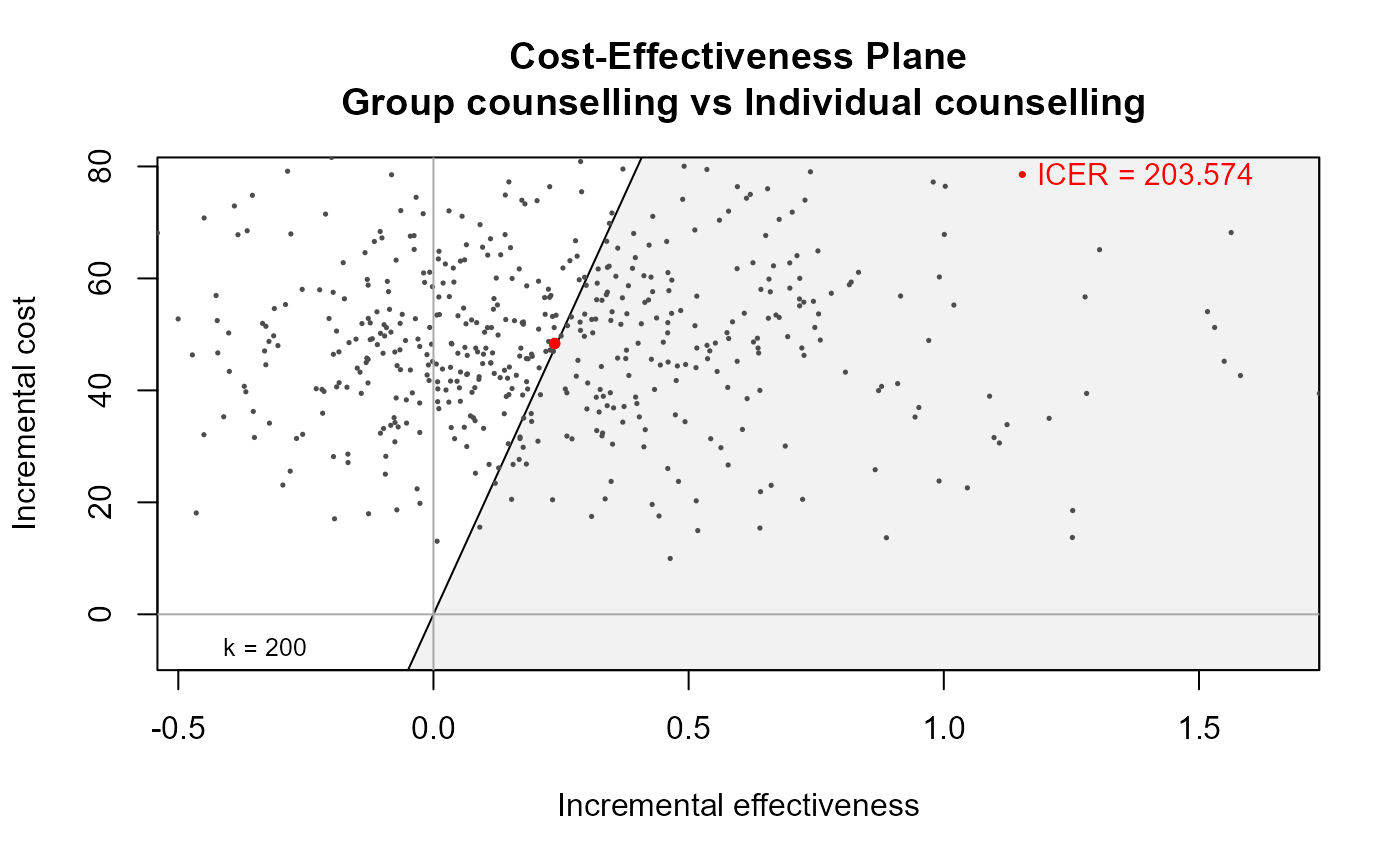
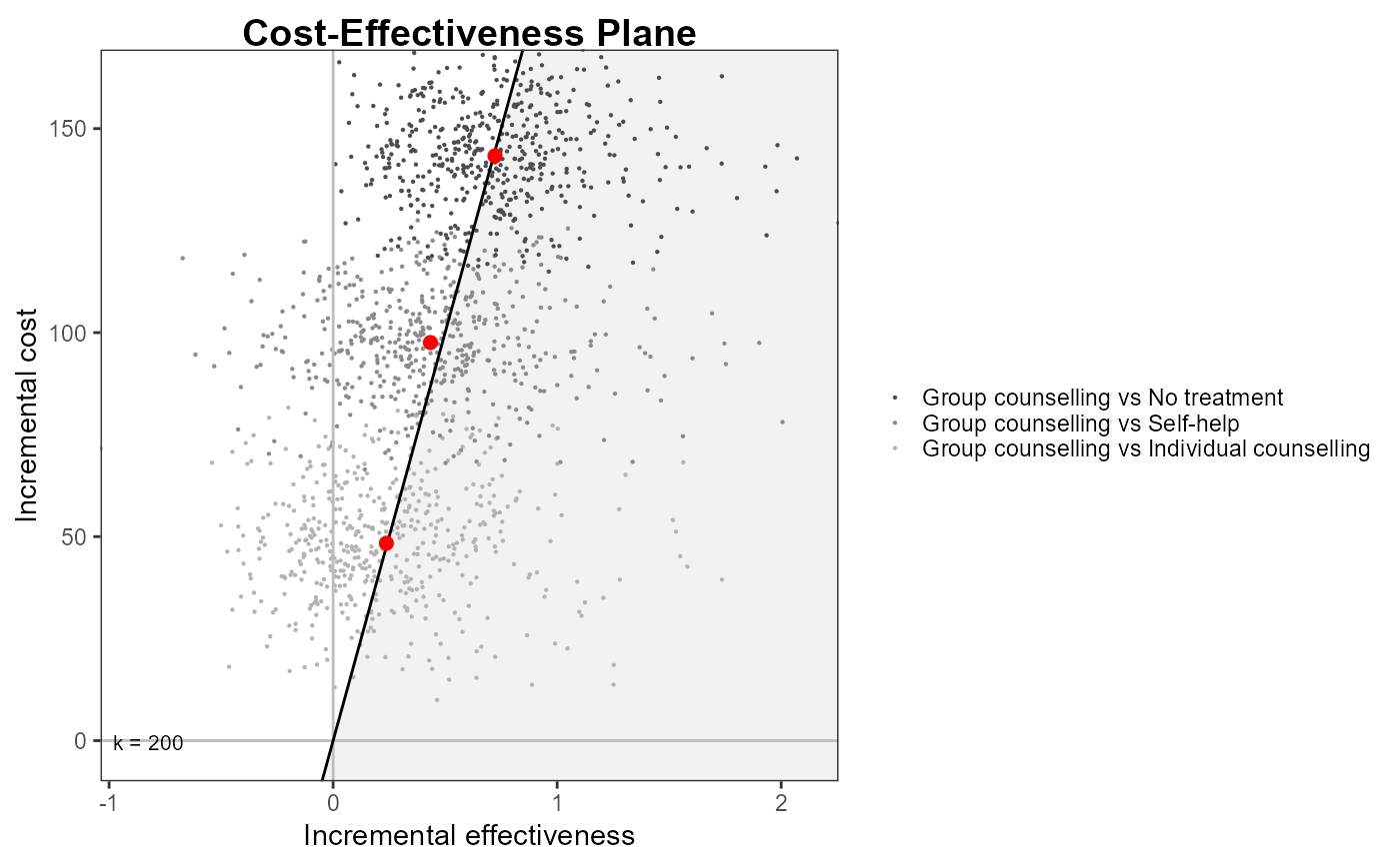
Produces a scatter plot of the cost-effectiveness plane, together with the sustainability area, as a function of the selected willingness to pay threshold.
Arguments
- he
A
bceaobject containing the results of the Bayesian modelling and the economic evaluation.- comparison
Selects the comparator, in case of more than two interventions being analysed. Default as
NULLplots all the comparisons together. Any subset of the possible comparisons can be selected (e.g.,comparison = c(1,3)orcomparison = 2).- wtp
The value of the willingness to pay parameter. Not used if
graph = "base"for multiple comparisons.- pos
Parameter to set the position of the legend; for a single comparison plot, the ICER legend position. Can be given in form of a string
(bottom|top)(right|left)for base graphics andbottom|top|left|rightfor ggplot2. It can be a two-elements vector, which specifies the relative position on the x and y axis respectively, or alternatively it can be in form of a logical variable, withFALSEindicating to use the default position andTRUEto place it on the bottom of the plot. Default value isc(1,1), that is the topright corner inside the plot area.- graph
A string used to select the graphical engine to use for plotting. Should (partial-) match the two options
"base"or"ggplot2". Default value is"base".- ...
If
graph = "ggplot2"and a named theme object is supplied, it will be passed to the ggplot2 object. The usual ggplot2 syntax is used. Additional graphical arguments:label.pos = FALSE: will place the willingness to pay label in a different position at the bottom of the graph - base and ggplot2 only (no label in plotly).line = list(color): a colour specifying the colour of the willingness-to-pay line.point = list(color): a vector of colours specifying the colour(s) associated to the cloud of points. Should be of length 1 or equal to the number of comparisons.point = list(size): a vector of colours specifying the size(s) of the points. Should be of length 1 or equal to the number of comparisons.point = list(shape): a vector of shapes specifying type(s) of the points. Should be of length 1 or equal to the number of comparisons.icer = list(color): a vector of colours specifying the colour(s) of the ICER points. Should be of length 1 or equal to the number of comparisons.icer = list(size): a vector of colours specifying the size(s) of the ICER points. Should be of length 1 or equal to the number of comparisons.area_include: logical, include or exclude the cost-effectiveness acceptability area (default is TRUE).area = list(color): a colour specifying the colour of the cost-effectiveness acceptability area.currency: Currency prefix to cost differential values - ggplot2 only.icer_annot: Annotate each ICER point with text label - ggplot2 only.
Value
If graph = "ggplot2" a ggplot object, or if graph = "plotly"
a plotly object containing the requested plot. Nothing is returned when
graph = "base", the default.
Grey dots show the simulated values for the joint distribution of the effectiveness and cost differentials. The larger red dot shows the ICER and the grey area identifies the sustainability area, i.e. the part of the plan for which the simulated values are below the willingness to pay threshold. The proportion of points in the sustainability area effectively represents the CEAC for a given value of the willingness to pay. If the comparators are more than 2 and no pairwise comparison is specified, all scatterplots are graphed using different colours.
Details
In the plotly version, point_colors, ICER_colors and area_color can also
be specified as rgba colours using either the [plotly]toRGB
function or a rgba colour string, e.g. 'rgba(1, 1, 1, 1)'.
References
Baio G, Dawid aP (2011). “Probabilistic sensitivity analysis in health economics.” Stat. Methods Med. Res., 1--20. ISSN 1477-0334, doi:10.1177/0962280211419832 , https://pubmed.ncbi.nlm.nih.gov/21930515/.
Baio G (2013). Bayesian Methods in Health Economics. CRC.
Examples
## create the bcea object for the smoking cessation example
data(Smoking)
m <- bcea(eff, cost, ref = 4, Kmax = 500, interventions = treats)
## produce the base plot
ceplane.plot(m, wtp = 200, graph = "base")
 ## select only one comparator
ceplane.plot(m, wtp = 200, graph = "base", comparison = 3)
 ## use ggplot2
if (requireNamespace("ggplot2")) {
ceplane.plot(m, wtp = 200, pos = "right", icer = list(size = 2), graph = "ggplot2")
}
 ## plotly
ceplane.plot(m, wtp = 200, graph = "plotly")
ceplane.plot(m, wtp = 200, comparison = 1, graph = "plotly")
